Improving old work
09 Nov 2017A post where I try to revamp some previous work I made. Based off a QGIS tutorial.
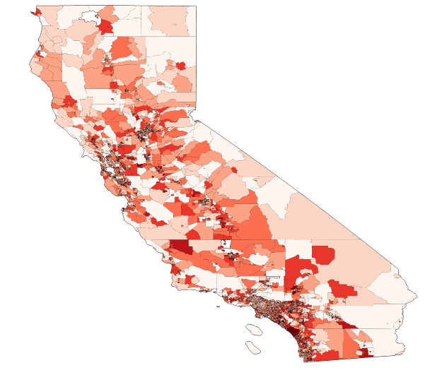
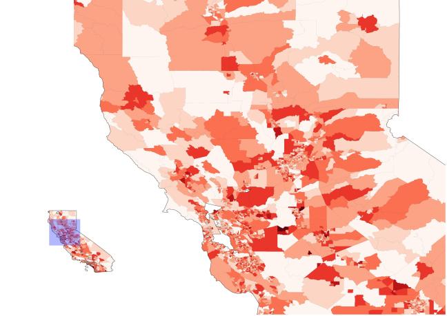
I submitted the maps above in a Lab assignment during my high school GIS course. It was basically the same as the QGIS tutorial on table joins, but it was adapted as an assignment. Looking back, the maps were giving off the wrong impression of the data as it was based on raw population numbers instead of the population density. This is particularly important for a chloropleth map which will colourfully exaggerate the population number according to the selected classification scheme. In addition, all the typical map elements are missing, not sure what I thinking there.
So I decided to improve the map! Simply put the reality is a lot less impressive:
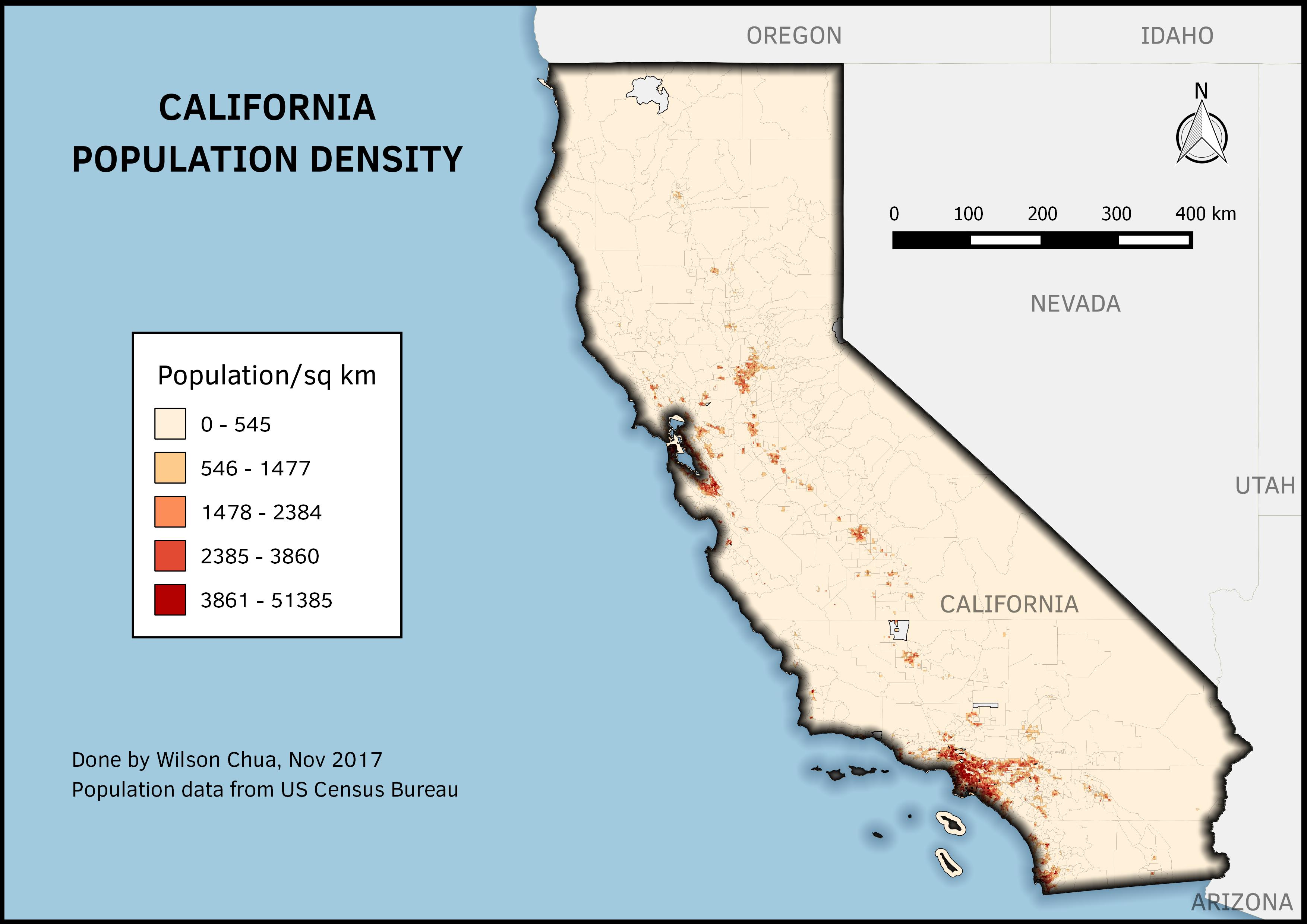
In terms of styling I used a inverted shapeburst fill for the “water”. This can really make the coastline stand out if you adjust the colour values correctly.
The resolution in the above image is pretty decent but just for clarity’s sake I did an atlas as well, generated over the individual counties.
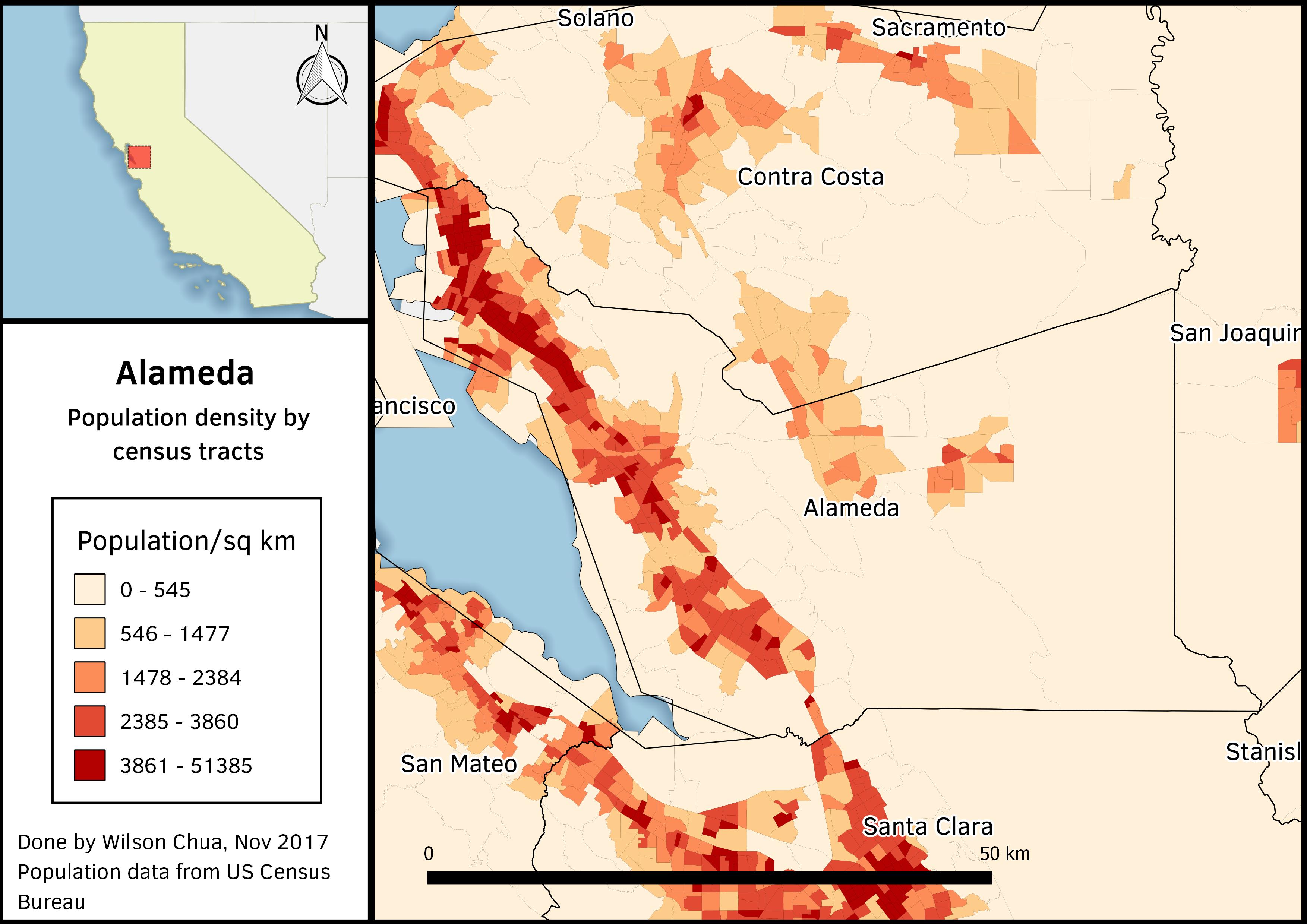
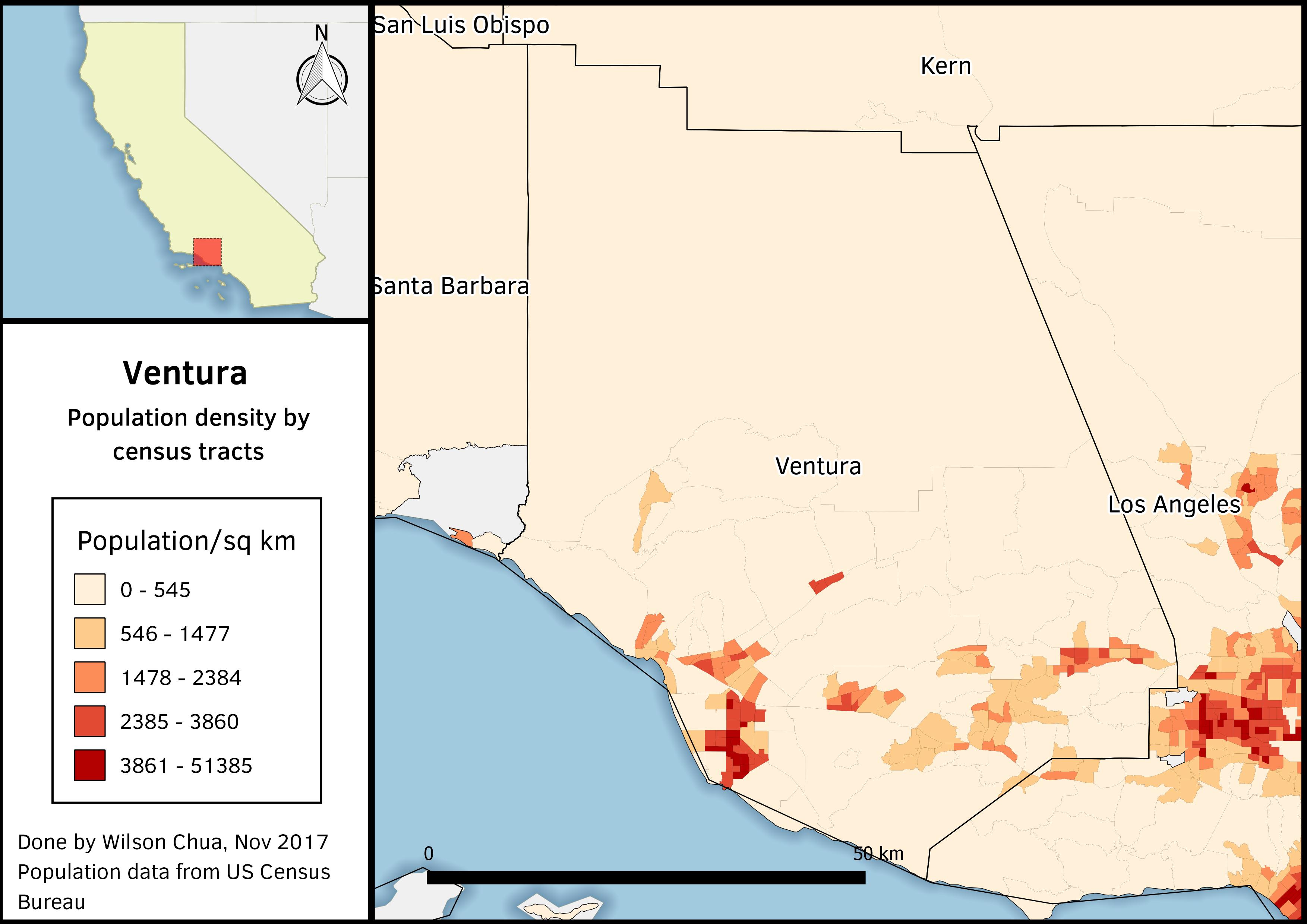
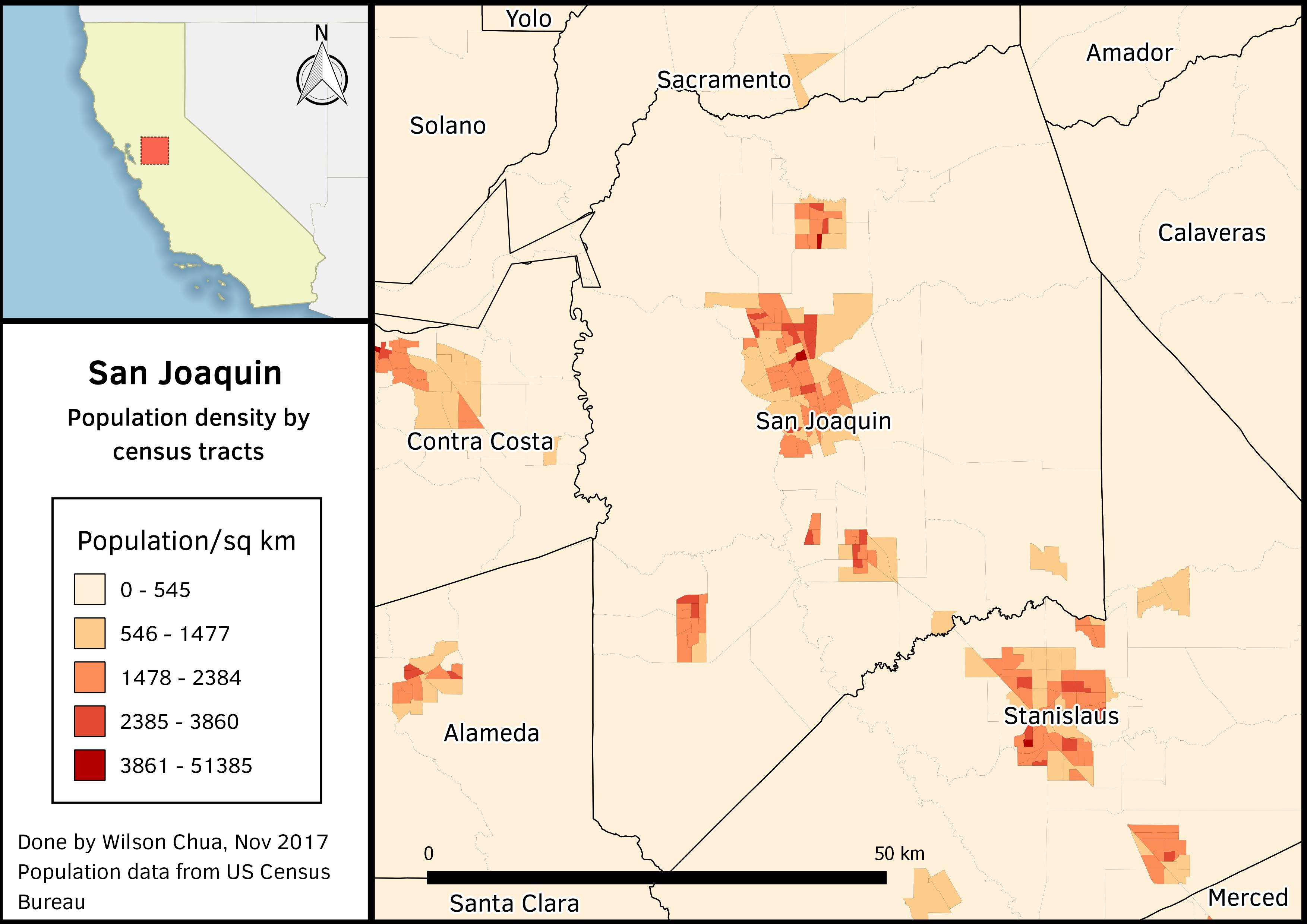
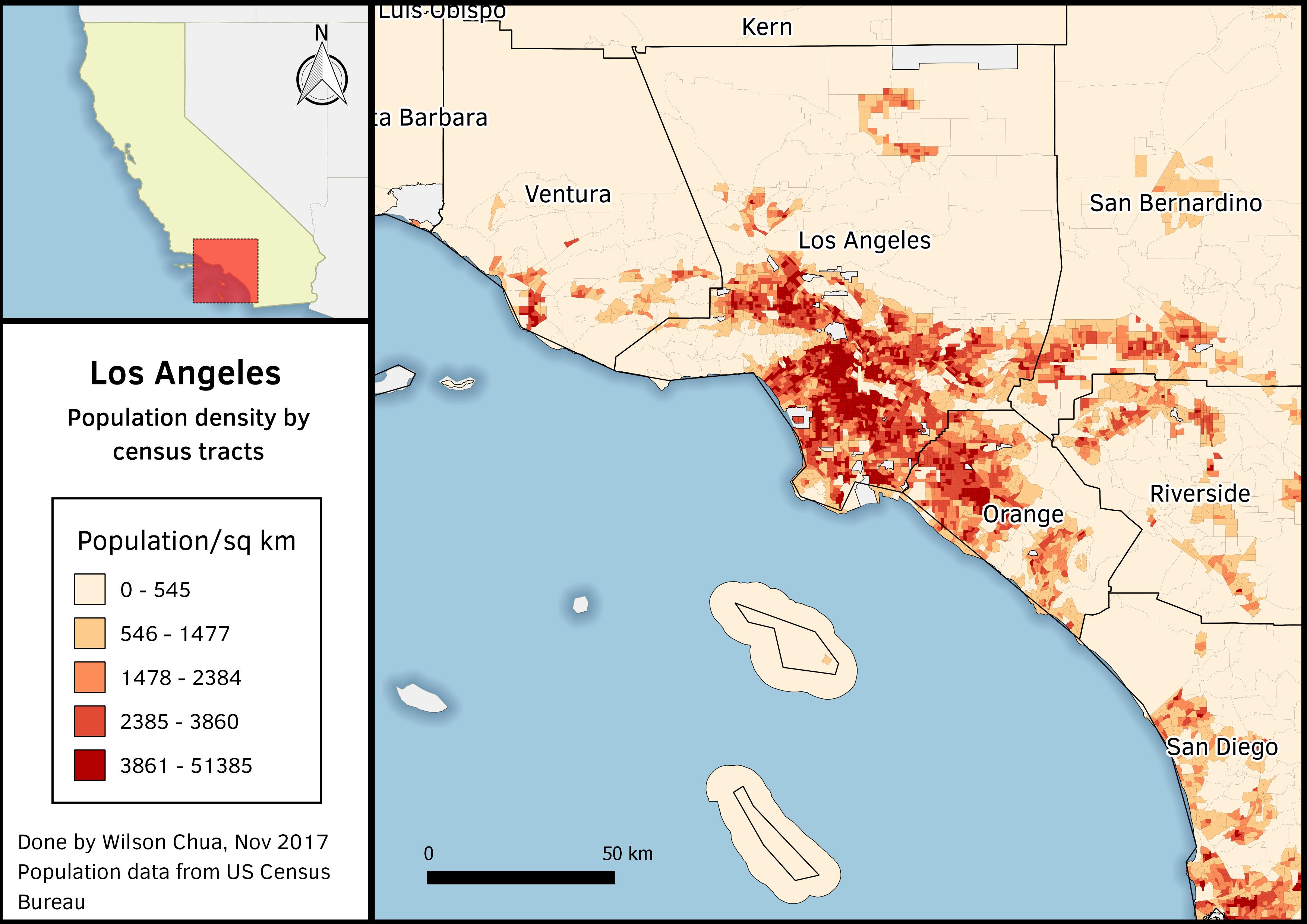
Clearly the boundaries of the census tracts and the counties don’t align for some reason. According to the U.S. Census Bureau the tracts “follow people rather than political boundaries” so the discrepancies between both cannot be resolved easily. However for the purpose of displaying the population density, these boundaries are only used for reference, so it’s not too much of an issue.